
什麼是 CSS 過渡以及如何使用它們
已發表: 2022-02-16在上一篇文章中,您了解了 CSS 動畫的基本概念以及如何使用它們。 我們可以說過渡是動畫的一種簡化形式,它們之間存在一些差異,觸發動畫的形式是最相關的一種。
另一個區別是轉換只有兩種狀態(初始狀態和最終狀態),而您可以使用@keyframes規則為動畫元素定義多個狀態。 轉換是在一個動作上觸發的,例如當懸停在一個元素上時,但是動畫可以在沒有特定動作的情況下發生,例如頁面加載後的動畫延遲。
在本教程中,我們將通過一個實際示例來學習 CSS 過渡的基本概念。 此外,您還將學習如何通過 CSS 使用圖像精靈。
開始吧!
步驟1。 - 建議的佈局
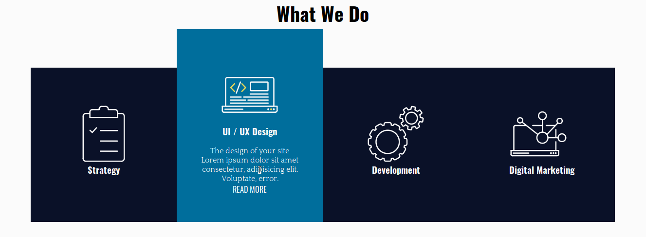
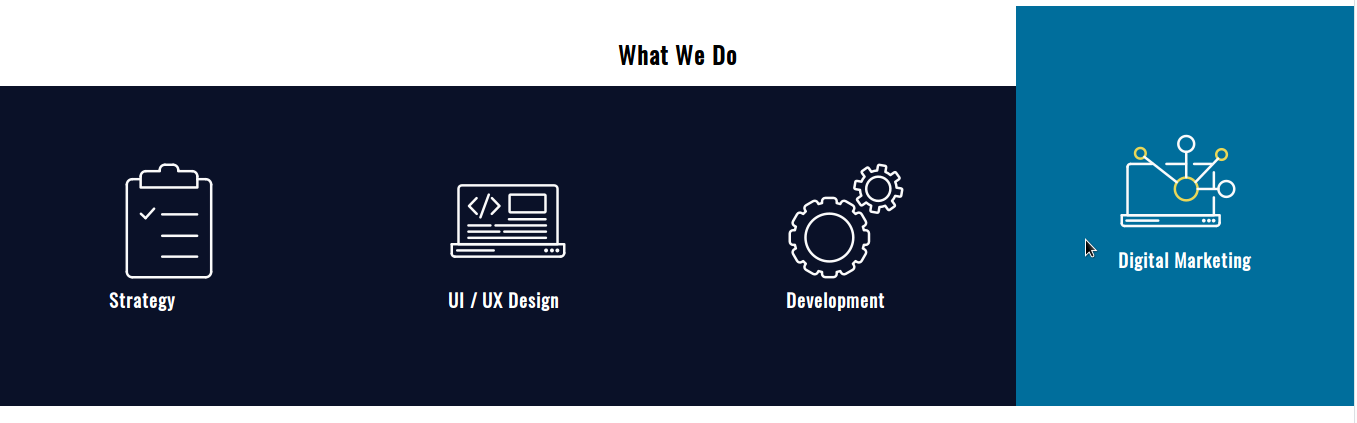
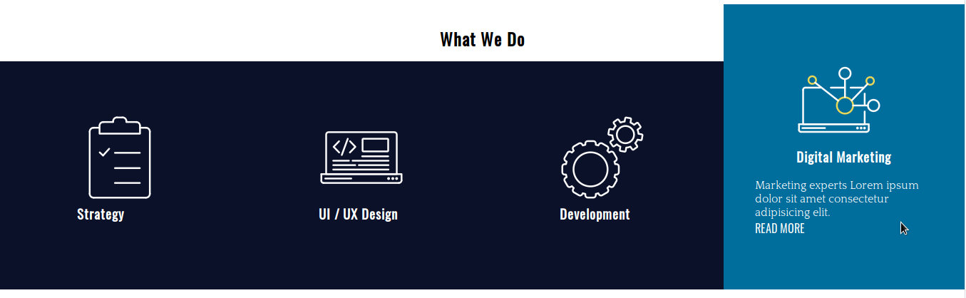
我們有 4 張卡片,用於宣傳網絡代理商的常規服務。 將鼠標懸停在它們上方時,卡片內的每個元素都會有不同的過渡以達到預期的效果。
步驟 # 2. - HTML
- 打開您喜歡的代碼編輯器
- 創建一個名為index.html的 HTML 文件
- 複製並粘貼此代碼:
 <!DOCTYPE html>
 <html lang="en">
 <head>
 <meta charset="UTF-8">
 <meta name="viewport" content="width=device-width, initial-scale=1.0">
 <meta http-equiv="X-UA-Compatible" content="ie=edge">
 <title>CSS Transitions</title>
 <link href="https://fonts.googleapis.com/css?family=Oswald|Quattrocento&display=swap" rel="stylesheet">
 <link rel="stylesheet" href="/style.css">
 </head>
 <body>
 <div class="experts">
 <h2>What We Do</h2>
 <div class="service-card-container">
 <div class="service-card">
 <div class="front">
 <span class="icon-strategy"></span>
 <h3>Strategy</h3>
 </div>
 <div class="hidden">
 <p>The main strategy of a web site is to make visitors convert.</p>
 <a href="#">Read more</a>
 </div>
 </div>
 <div class="service-card">
 <div class="front">
 <span class="icon-ui-ux-design"></span>
 <h3>UI / UX Design</h3>
 </div>
 <div class="hidden">
 <p>The design of your site Lorem ipsum dolor sit amet consectetur, adipisicing elit. Voluptate, error.</p>
 <a href="#">Read more</a>
 </div>
 </div>
 <div class="service-card">
 <div class="front">
 <span class="icon-development"></span>
 <h3>Development</h3>
 </div>
 <div class="hidden">
 <p>Our team of developers Lorem ipsum dolor sit amet, consectetur adipisicing.</p>
 <a href="#">Read more</a>
 </div>
 </div>
 <div class="service-card">
 <div class="front">
 <span class="icon-digital-marketing"></span>
 <h3>Digital Marketing</h3>
 </div>
 <div class="hidden">
 <p>Marketing experts Lorem ipsum dolor sit amet consectetur adipisicing elit.</p>
 <a href="#">Read more</a>
 </div>
 </div>
 </div>
 </div>
 </body>
</html><!DOCTYPE html>
<html lang="en">
<head>
<meta charset="UTF-8">
<meta name="viewport" content="width=device-width, initial-scale=1.0">
<meta http-equiv="X-UA-Compatible" content="ie=edge">
<title>CSS Transitions</title>
<link href="https://fonts.googleapis.com/css?family=Oswald|Quattrocento&display=swap" rel="stylesheet">
<link rel="stylesheet" href="/style.css">
</head>
<body>
<div class="experts">
<h2>What We Do</h2>
<div class="service-card-container">
<div class="service-card">
<div class="front">
<span class="icon-strategy"></span>
<h3>Strategy</h3>
</div>
<div class="hidden">
<p>The main strategy of a web site is to make visitors convert.</p>
<a href="#">Read more</a>
</div>
</div>
<div class="service-card">
<div class="front">
<span class="icon-ui-ux-design"></span>
<h3>UI / UX Design</h3>
</div>
<div class="hidden">
<p>The design of your site Lorem ipsum dolor sit amet consectetur, adipisicing elit. Voluptate, error.</p>
<a href="#">Read more</a>
</div>
</div>
<div class="service-card">
<div class="front">
<span class="icon-development"></span>
<h3>Development</h3>
</div>
<div class="hidden">
<p>Our team of developers Lorem ipsum dolor sit amet, consectetur adipisicing.</p>
<a href="#">Read more</a>
</div>
</div>
<div class="service-card">
<div class="front">
<span class="icon-digital-marketing"></span>
<h3>Digital Marketing</h3>
</div>
<div class="hidden">
<p>Marketing experts Lorem ipsum dolor sit amet consectetur adipisicing elit.</p>
<a href="#">Read more</a>
</div>
</div>
</div>
</div>
</body>
</html>
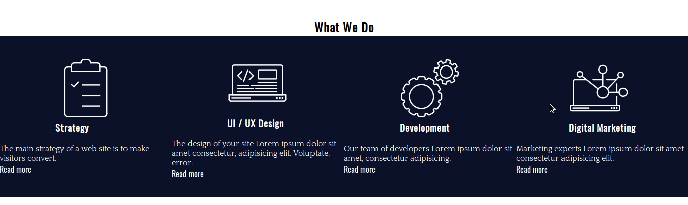
服務卡容器有 4 張不同的卡。 每張卡片由一個圖標、一個標題、一些文本和一個指向網站上相應信息的鏈接組成。 將鼠標懸停在卡片上時將顯示文本和鏈接,否則它們將被隱藏。
步驟#3。 - 基本 CSS 樣式
- 創建一個 CSS 文件並將其命名為style.css — 在 HTML 代碼中已經是該文件和 Google 字體的鏈接
- 複製並粘貼這些樣式以更改卡片的排版樣式和背景顏色:
 /* BASIC RESET */

 * {
 margin: 0;
 padding: 0;
 box-sizing: border-box;
 list-style: none;
 text-decoration: none;
 }

 /* TYPOGRAPHY */

 body {
 font-family: 'Quattrocento', serif;
 }

 h1,
 h2,
 h3,
 h4,
 h5,
 h6,
 a {
 font-family: 'Oswald', sans-serif;
 }

 /* BACKGROUND */

 .service-card {
 background-color: #0a1128;
 color: white;
 }

 .service-card a {
 color: white;
}/* BASIC RESET */
* {
margin: 0;
padding: 0;
box-sizing: border-box;
list-style: none;
text-decoration: none;
}
/* TYPOGRAPHY */
body {
font-family: 'Quattrocento', serif;
}
h1,
h2,
h3,
h4,
h5,
h6,
a {
font-family: 'Oswald', sans-serif;
}
/* BACKGROUND */
.service-card {
background-color: #0a1128;
color: white;
}
.service-card a {
color: white;
}
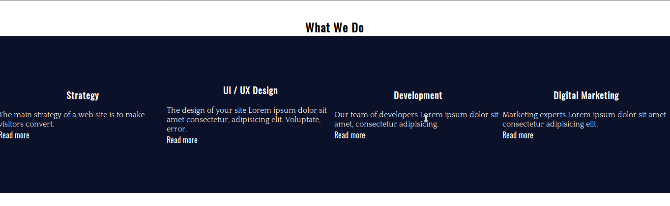
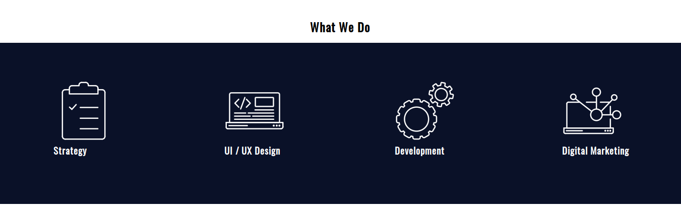
步驟4。 - 佈局樣式
讓我們使用 CSS Grid 創建卡片並水平排列它們。
- 編輯 CSS 代碼:
 /* LAYOUT */

 .experts {
 margin-top: 36px;
 }

 .experts h2 {
 text-align: center;
 }

 .service-card-container {
 display: grid;
 grid-template-columns: repeat(4, 1fr);
 }

 .service-card {
 display: grid;
 grid-template-columns: 1fr;
 grid-template-rows: auto auto;
 grid-row-gap: 18px;
 justify-items: center;
 align-content: center;
 height: 320px;
 }
服務卡容器是一個有 4 列的水平網格。 每張卡片也被聲明為具有 2 行的網格容器。 請注意,我們已經為每張卡片聲明了一個固定的高度。

步驟#5。 - 圖像精靈
根據 W3Schools 的說法,圖像精靈是放入單個圖像的圖像集合。 您可以節省帶寬,因為頁面不需要為它必須加載的每個圖像發出服務器請求。 它將請求圖像一次,然後您將圖像的所需部分映射到 CSS 代碼中。
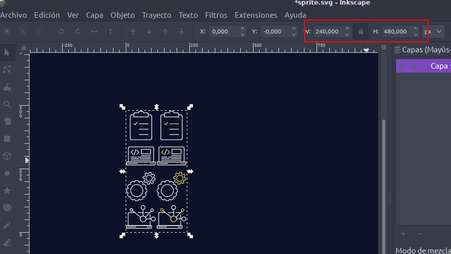
圖像寬 240 像素,高 480 像素。 每個圖標都覆蓋 120x120 像素的區域。 為了映射每一個圖像,我們從圖像的左上角開始,坐標為(0px 0px)——按照“左-上”的順序。
這樣,精靈左欄中的圖像位於:
- 0 像素 0 像素
- 0像素-120像素
- 0 像素 -240 像素
- 0 像素 -360 像素
這些是懸停前要使用的圖像。
精靈右欄中的圖像位於:
- 120 像素 0 像素
- 120像素-120像素
- 120像素-240像素
- 120像素-360像素
- 編輯 CSS 代碼:
 .service-card span {
 display: inline-block; /* to be able to apply width and height to the element */
 }

 .icon-strategy {
 background: url(./sprite.png) 0px 0;
 width: 120px;
 height: 120px;
 }

 .icon-ui-ux-design {
 background: url(./sprite.png) 0px -120px;
 width: 120px;
 height: 120px;
 }

 .icon-development {
 background: url(./sprite.png) 0px -240px;
 width: 120px;
 height: 120px;
 }
 .icon-digital-marketing {
   background: url(./sprite.png) 0px -360px;
   width: 120px;
   height: 120px;
}/* LAYOUT */
.experts {
margin-top: 36px;
}
.experts h2 {
text-align: center;
}
.service-card-container {
display: grid;
grid-template-columns: repeat(4, 1fr);
}
.service-card {
display: grid;
grid-template-columns: 1fr;
grid-template-rows: auto auto;
grid-row-gap: 18px;
justify-items: center;
align-content: center;
height: 320px;
}
服務卡容器是一個有 4 列的水平網格。 每張卡片也被聲明為具有 2 行的網格容器。 請注意,我們已經為每張卡片聲明了一個固定的高度。
步驟#5。 - 圖像精靈
根據 W3Schools 的說法,圖像精靈是放入單個圖像的圖像集合。 您可以節省帶寬,因為頁面不需要為它必須加載的每個圖像發出服務器請求。 它將請求圖像一次,然後您將圖像的所需部分映射到 CSS 代碼中。
圖像寬 240 像素,高 480 像素。 每個圖標都覆蓋 120x120 像素的區域。 為了映射每一個圖像,我們從圖像的左上角開始,坐標為(0px 0px)——按照“左-上”的順序。
這樣,精靈左欄中的圖像位於:
- 0 像素 0 像素
- 0像素-120像素
- 0 像素 -240 像素
- 0 像素 -360 像素
這些是懸停前要使用的圖像。
精靈右欄中的圖像位於:
- 120 像素 0 像素
- 120像素-120像素
- 120像素-240像素
- 120像素-360像素
- 編輯 CSS 代碼:
 .service-card span {
 display: inline-block; /* to be able to apply width and height to the element */
 }

 .icon-strategy {
 background: url(./sprite.png) 0px 0;
 width: 120px;
 height: 120px;
 }

 .icon-ui-ux-design {
 background: url(./sprite.png) 0px -120px;
 width: 120px;
 height: 120px;
 }

 .icon-development {
 background: url(./sprite.png) 0px -240px;
 width: 120px;
 height: 120px;
 }
 .icon-digital-marketing {
   background: url(./sprite.png) 0px -360px;
   width: 120px;
   height: 120px;
 }
還不錯吧? 讓我們添加一些裝飾性的東西,用一些填充來完成這部分。
- 編輯 CSS 代碼:
 .service-card-container {
 display: grid;
 grid-template-columns: repeat(4, 1fr);
 padding: 0.9em 0 1.8em 0;
 }

 .service-card {
 display: grid;
 grid-template-columns: 1fr;
 grid-template-rows: auto auto;
 grid-row-gap: 18px;
 justify-items: center;
 align-content: center;
 height: 320px;
 padding: 0 2.75em;
}.service-card-container {
display: grid;
grid-template-columns: repeat(4, 1fr);
padding: 0.9em 0 1.8em 0;
}
.service-card {
display: grid;
grid-template-columns: 1fr;
grid-template-rows: auto auto;
grid-row-gap: 18px;
justify-items: center;
align-content: center;
height: 320px;
padding: 0 2.75em;
}
步驟#6。 - CSS 過渡
CSS 過渡屬性有 4 個不同的子屬性:
- 過渡屬性(元素的屬性,將應用過渡)
- 過渡期
- 過渡定時功能
- 轉換延遲
簡寫是:
過渡:[過渡屬性] [過渡持續時間] [過渡定時功能] [過渡延遲]
- 編輯 CSS 代碼:
 /* TRANSITIONS */

 .service-card {
 transition: margin-top 0.2s ease-out, height 0.2s ease-out, background 0.2s ease-out;
 }

 .service-card:hover {
 margin-top: -5em;
 height: 25em;
 background: #006e9c;
 }
如您所見,可以將多個轉換應用於不同的元素屬性,方法是用逗號分隔它們。 這些轉換都沒有延遲。
為了讓卡片向上滾動,你在頂部設置了一個負邊距,並將這個邊距的絕對值添加到元素的高度(320px == 20em)。
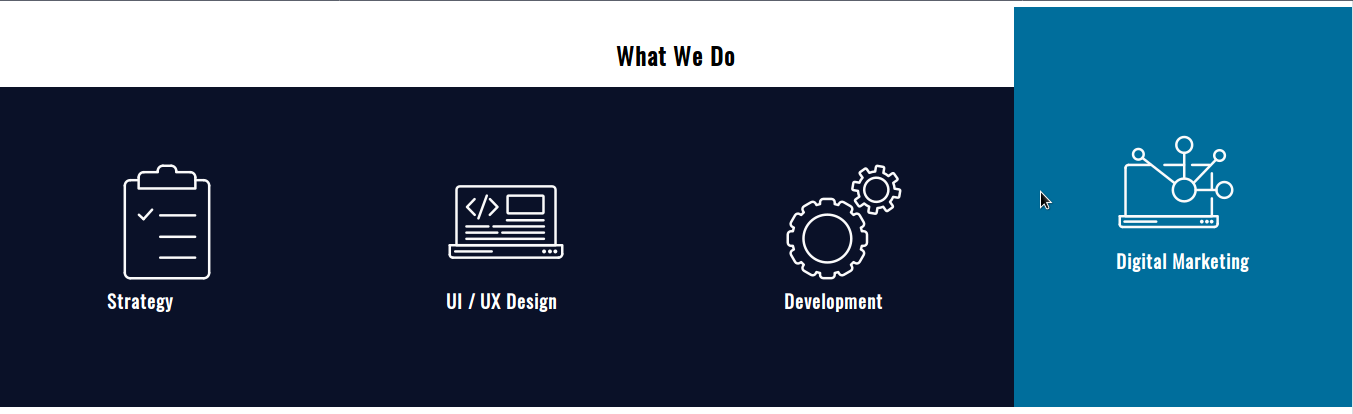
現在是時候定位圖像並通過過渡使它們發生變化。
- 編輯 CSS 代碼:
 .icon-strategy,
 .icon-ui-ux-design,
 .icon-development,
 .icon-digital-marketing {
   transition: background 0.4s step-end;
 }

 .service-card:hover .icon-strategy {
   background: url(./sprite.png) 120px 0;
   width: 120px;
   height: 120px;
 }

 .service-card:hover .icon-ui-ux-design {
   background: url(./sprite.png) 120px -120px;
   width: 120px;
   height: 120px;
 }

 .service-card:hover .icon-development {
   background: url(./sprite.png) 120px -240px;
   width: 120px;
   height: 120px;
 }

 .service-card:hover .icon-digital-marketing {
   background: url(./sprite.png) 120px -360px;
   width: 120px;
   height: 120px;
 }
再次:
- 過渡屬性:背景
- 過渡持續時間:0.4s
- 過渡定時功能:步進結束
其餘的只是映射到圖像精靈上的確切坐標(上面詳述)。
最後,讓我們以.hidden容器為目標。
- 編輯 CSS 代碼:
 .hidden,
 .hidden a {
 transition: color 0.4s ease-out 0.2s;
 }

 .service-card:hover .hidden {
 height: auto;
 }
 .service-card:hover .hidden,
 .service-card:hover .hidden a {
 color: white;
 }
這裡有兩個細節需要注意:
- 文本顏色的過渡有0.2s的過渡延遲
- 元素的height屬性在懸停時發生變化,沒有過渡
所有主要瀏覽器都支持轉換。
我希望你喜歡這個練習。 謝謝閱讀!
代碼可以在這裡找到。