
什么是 CSS 过渡以及如何使用它们
已发表: 2022-02-16在上一篇文章中,您了解了 CSS 动画的基本概念以及如何使用它们。 我们可以说过渡是动画的一种简化形式,它们之间存在一些差异,触发动画的形式是最相关的一种。
另一个区别是转换只有两种状态(初始状态和最终状态),而您可以使用@keyframes规则为动画元素定义多个状态。 转换是在一个动作上触发的,例如当悬停在一个元素上时,但是动画可以在没有特定动作的情况下发生,例如页面加载后的动画延迟。
在本教程中,我们将通过一个实际示例来学习 CSS 过渡的基本概念。 此外,您还将学习如何通过 CSS 使用图像精灵。
开始吧!
步骤1。 - 建议的布局
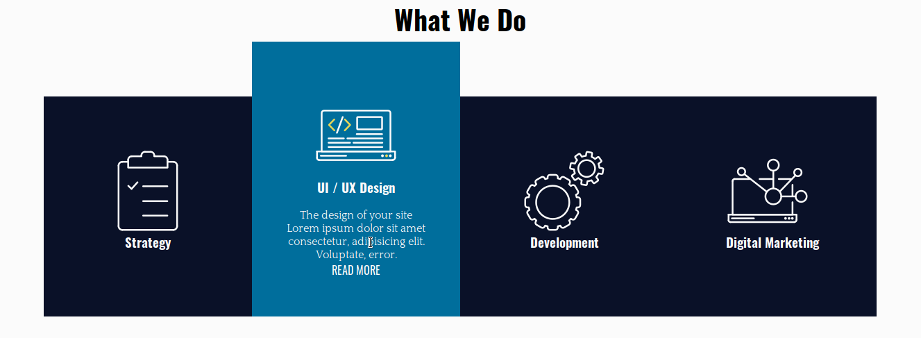
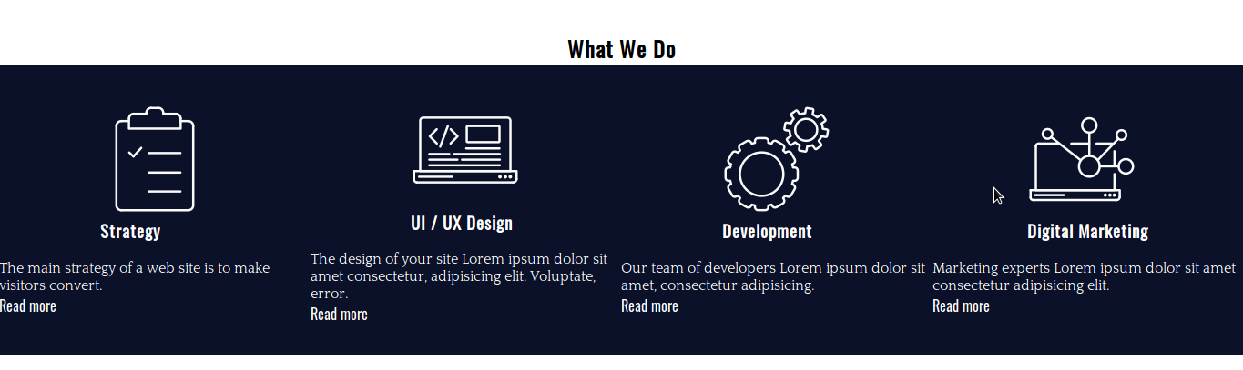
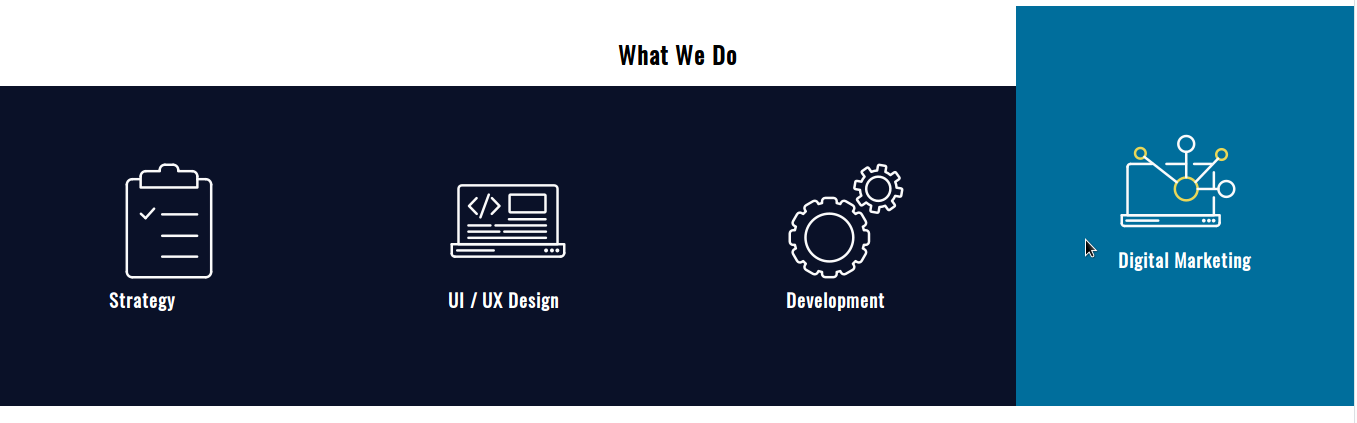
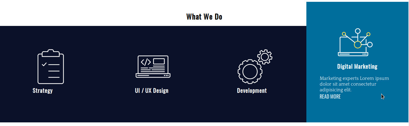
我们有 4 张卡片,用于宣传网络代理商的常规服务。 将鼠标悬停在它们上方时,卡片内的每个元素都会有不同的过渡以达到预期的效果。
步骤 # 2. - HTML
- 打开您喜欢的代码编辑器
- 创建一个名为index.html的 HTML 文件
- 复制并粘贴此代码:
 <!DOCTYPE html>
 <html lang="en">
 <head>
 <meta charset="UTF-8">
 <meta name="viewport" content="width=device-width, initial-scale=1.0">
 <meta http-equiv="X-UA-Compatible" content="ie=edge">
 <title>CSS Transitions</title>
 <link href="https://fonts.googleapis.com/css?family=Oswald|Quattrocento&display=swap" rel="stylesheet">
 <link rel="stylesheet" href="/style.css">
 </head>
 <body>
 <div class="experts">
 <h2>What We Do</h2>
 <div class="service-card-container">
 <div class="service-card">
 <div class="front">
 <span class="icon-strategy"></span>
 <h3>Strategy</h3>
 </div>
 <div class="hidden">
 <p>The main strategy of a web site is to make visitors convert.</p>
 <a href="#">Read more</a>
 </div>
 </div>
 <div class="service-card">
 <div class="front">
 <span class="icon-ui-ux-design"></span>
 <h3>UI / UX Design</h3>
 </div>
 <div class="hidden">
 <p>The design of your site Lorem ipsum dolor sit amet consectetur, adipisicing elit. Voluptate, error.</p>
 <a href="#">Read more</a>
 </div>
 </div>
 <div class="service-card">
 <div class="front">
 <span class="icon-development"></span>
 <h3>Development</h3>
 </div>
 <div class="hidden">
 <p>Our team of developers Lorem ipsum dolor sit amet, consectetur adipisicing.</p>
 <a href="#">Read more</a>
 </div>
 </div>
 <div class="service-card">
 <div class="front">
 <span class="icon-digital-marketing"></span>
 <h3>Digital Marketing</h3>
 </div>
 <div class="hidden">
 <p>Marketing experts Lorem ipsum dolor sit amet consectetur adipisicing elit.</p>
 <a href="#">Read more</a>
 </div>
 </div>
 </div>
 </div>
 </body>
</html><!DOCTYPE html>
<html lang="en">
<head>
<meta charset="UTF-8">
<meta name="viewport" content="width=device-width, initial-scale=1.0">
<meta http-equiv="X-UA-Compatible" content="ie=edge">
<title>CSS Transitions</title>
<link href="https://fonts.googleapis.com/css?family=Oswald|Quattrocento&display=swap" rel="stylesheet">
<link rel="stylesheet" href="/style.css">
</head>
<body>
<div class="experts">
<h2>What We Do</h2>
<div class="service-card-container">
<div class="service-card">
<div class="front">
<span class="icon-strategy"></span>
<h3>Strategy</h3>
</div>
<div class="hidden">
<p>The main strategy of a web site is to make visitors convert.</p>
<a href="#">Read more</a>
</div>
</div>
<div class="service-card">
<div class="front">
<span class="icon-ui-ux-design"></span>
<h3>UI / UX Design</h3>
</div>
<div class="hidden">
<p>The design of your site Lorem ipsum dolor sit amet consectetur, adipisicing elit. Voluptate, error.</p>
<a href="#">Read more</a>
</div>
</div>
<div class="service-card">
<div class="front">
<span class="icon-development"></span>
<h3>Development</h3>
</div>
<div class="hidden">
<p>Our team of developers Lorem ipsum dolor sit amet, consectetur adipisicing.</p>
<a href="#">Read more</a>
</div>
</div>
<div class="service-card">
<div class="front">
<span class="icon-digital-marketing"></span>
<h3>Digital Marketing</h3>
</div>
<div class="hidden">
<p>Marketing experts Lorem ipsum dolor sit amet consectetur adipisicing elit.</p>
<a href="#">Read more</a>
</div>
</div>
</div>
</div>
</body>
</html>
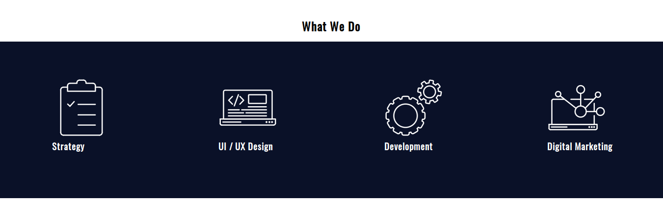
服务卡容器有 4 张不同的卡。 每张卡片由一个图标、一个标题、一些文本和一个指向网站上相应信息的链接组成。 将鼠标悬停在卡片上时将显示文本和链接,否则它们将被隐藏。
步骤#3。 - 基本 CSS 样式
- 创建一个 CSS 文件并将其命名为style.css — 在 HTML 代码中已经是该文件和 Google 字体的链接
- 复制并粘贴这些样式以更改卡片的排版样式和背景颜色:
 /* BASIC RESET */

 * {
 margin: 0;
 padding: 0;
 box-sizing: border-box;
 list-style: none;
 text-decoration: none;
 }

 /* TYPOGRAPHY */

 body {
 font-family: 'Quattrocento', serif;
 }

 h1,
 h2,
 h3,
 h4,
 h5,
 h6,
 a {
 font-family: 'Oswald', sans-serif;
 }

 /* BACKGROUND */

 .service-card {
 background-color: #0a1128;
 color: white;
 }

 .service-card a {
 color: white;
}/* BASIC RESET */
* {
margin: 0;
padding: 0;
box-sizing: border-box;
list-style: none;
text-decoration: none;
}
/* TYPOGRAPHY */
body {
font-family: 'Quattrocento', serif;
}
h1,
h2,
h3,
h4,
h5,
h6,
a {
font-family: 'Oswald', sans-serif;
}
/* BACKGROUND */
.service-card {
background-color: #0a1128;
color: white;
}
.service-card a {
color: white;
}
步骤4。 - 布局样式
让我们使用 CSS Grid 创建卡片并水平排列它们。
- 编辑 CSS 代码:
 /* LAYOUT */

 .experts {
 margin-top: 36px;
 }

 .experts h2 {
 text-align: center;
 }

 .service-card-container {
 display: grid;
 grid-template-columns: repeat(4, 1fr);
 }

 .service-card {
 display: grid;
 grid-template-columns: 1fr;
 grid-template-rows: auto auto;
 grid-row-gap: 18px;
 justify-items: center;
 align-content: center;
 height: 320px;
 }
服务卡容器是一个有 4 列的水平网格。 每张卡片也被声明为具有 2 行的网格容器。 请注意,我们已经为每张卡片声明了一个固定的高度。

步骤#5。 - 图像精灵
根据 W3Schools 的说法,图像精灵是放入单个图像的图像集合。 您可以节省带宽,因为页面不需要为它必须加载的每个图像发出服务器请求。 它将请求图像一次,然后您将图像的所需部分映射到 CSS 代码中。
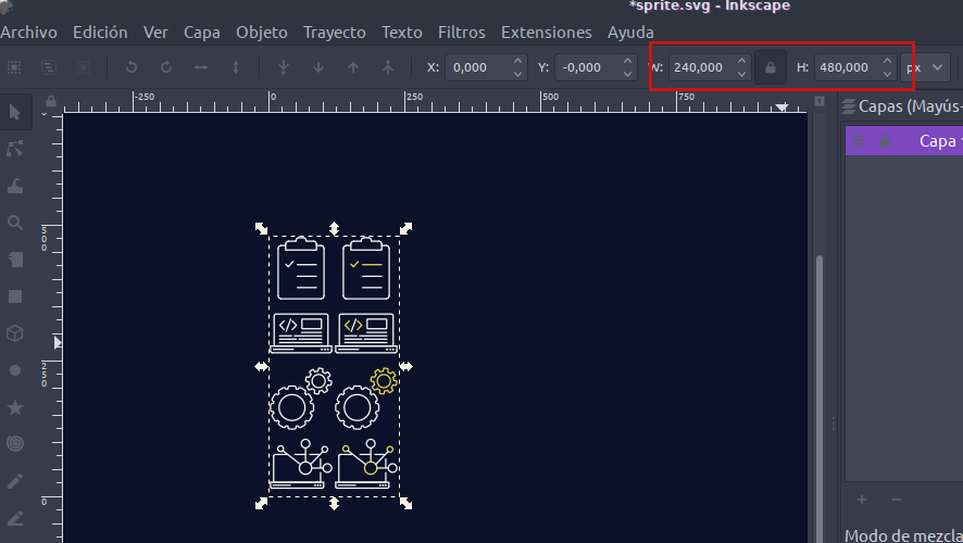
图像宽 240 像素,高 480 像素。 每个图标都覆盖 120x120 像素的区域。 为了映射每一个图像,我们从图像的左上角开始,坐标为(0px 0px)——按照“左-上”的顺序。
这样,精灵左栏中的图像位于:
- 0 像素 0 像素
- 0像素-120像素
- 0 像素 -240 像素
- 0 像素 -360 像素
这些是悬停前要使用的图像。
精灵右栏中的图像位于:
- 120 像素 0 像素
- 120像素-120像素
- 120像素-240像素
- 120像素-360像素
- 编辑 CSS 代码:
 .service-card span {
 display: inline-block; /* to be able to apply width and height to the element */
 }

 .icon-strategy {
 background: url(./sprite.png) 0px 0;
 width: 120px;
 height: 120px;
 }

 .icon-ui-ux-design {
 background: url(./sprite.png) 0px -120px;
 width: 120px;
 height: 120px;
 }

 .icon-development {
 background: url(./sprite.png) 0px -240px;
 width: 120px;
 height: 120px;
 }
 .icon-digital-marketing {
   background: url(./sprite.png) 0px -360px;
   width: 120px;
   height: 120px;
}/* LAYOUT */
.experts {
margin-top: 36px;
}
.experts h2 {
text-align: center;
}
.service-card-container {
display: grid;
grid-template-columns: repeat(4, 1fr);
}
.service-card {
display: grid;
grid-template-columns: 1fr;
grid-template-rows: auto auto;
grid-row-gap: 18px;
justify-items: center;
align-content: center;
height: 320px;
}
服务卡容器是一个有 4 列的水平网格。 每张卡片也被声明为具有 2 行的网格容器。 请注意,我们已经为每张卡片声明了一个固定的高度。
步骤#5。 - 图像精灵
根据 W3Schools 的说法,图像精灵是放入单个图像的图像集合。 您可以节省带宽,因为页面不需要为它必须加载的每个图像发出服务器请求。 它将请求图像一次,然后您将图像的所需部分映射到 CSS 代码中。
图像宽 240 像素,高 480 像素。 每个图标都覆盖 120x120 像素的区域。 为了映射每一个图像,我们从图像的左上角开始,坐标为(0px 0px)——按照“左-上”的顺序。
这样,精灵左栏中的图像位于:
- 0 像素 0 像素
- 0像素-120像素
- 0 像素 -240 像素
- 0 像素 -360 像素
这些是悬停前要使用的图像。
精灵右栏中的图像位于:
- 120 像素 0 像素
- 120像素-120像素
- 120像素-240像素
- 120像素-360像素
- 编辑 CSS 代码:
 .service-card span {
 display: inline-block; /* to be able to apply width and height to the element */
 }

 .icon-strategy {
 background: url(./sprite.png) 0px 0;
 width: 120px;
 height: 120px;
 }

 .icon-ui-ux-design {
 background: url(./sprite.png) 0px -120px;
 width: 120px;
 height: 120px;
 }

 .icon-development {
 background: url(./sprite.png) 0px -240px;
 width: 120px;
 height: 120px;
 }
 .icon-digital-marketing {
   background: url(./sprite.png) 0px -360px;
   width: 120px;
   height: 120px;
 }
还不错吧? 让我们添加一些装饰性的东西,用一些填充来完成这部分。
- 编辑 CSS 代码:
 .service-card-container {
 display: grid;
 grid-template-columns: repeat(4, 1fr);
 padding: 0.9em 0 1.8em 0;
 }

 .service-card {
 display: grid;
 grid-template-columns: 1fr;
 grid-template-rows: auto auto;
 grid-row-gap: 18px;
 justify-items: center;
 align-content: center;
 height: 320px;
 padding: 0 2.75em;
}.service-card-container {
display: grid;
grid-template-columns: repeat(4, 1fr);
padding: 0.9em 0 1.8em 0;
}
.service-card {
display: grid;
grid-template-columns: 1fr;
grid-template-rows: auto auto;
grid-row-gap: 18px;
justify-items: center;
align-content: center;
height: 320px;
padding: 0 2.75em;
}
步骤#6。 - CSS 过渡
CSS 过渡属性有 4 个不同的子属性:
- 过渡属性(元素的属性,将应用过渡)
- 过渡期
- 过渡定时功能
- 转换延迟
简写是:
过渡:[过渡属性] [过渡持续时间] [过渡定时功能] [过渡延迟]
- 编辑 CSS 代码:
 /* TRANSITIONS */

 .service-card {
 transition: margin-top 0.2s ease-out, height 0.2s ease-out, background 0.2s ease-out;
 }

 .service-card:hover {
 margin-top: -5em;
 height: 25em;
 background: #006e9c;
 }
如您所见,可以将多个转换应用于不同的元素属性,方法是用逗号分隔它们。 这些转换都没有延迟。
为了让卡片向上滚动,你在顶部设置了一个负边距,并将这个边距的绝对值添加到元素的高度(320px == 20em)。
现在是时候定位图像并通过过渡使它们发生变化。
- 编辑 CSS 代码:
 .icon-strategy,
 .icon-ui-ux-design,
 .icon-development,
 .icon-digital-marketing {
   transition: background 0.4s step-end;
 }

 .service-card:hover .icon-strategy {
   background: url(./sprite.png) 120px 0;
   width: 120px;
   height: 120px;
 }

 .service-card:hover .icon-ui-ux-design {
   background: url(./sprite.png) 120px -120px;
   width: 120px;
   height: 120px;
 }

 .service-card:hover .icon-development {
   background: url(./sprite.png) 120px -240px;
   width: 120px;
   height: 120px;
 }

 .service-card:hover .icon-digital-marketing {
   background: url(./sprite.png) 120px -360px;
   width: 120px;
   height: 120px;
 }
再次:
- 过渡属性:背景
- 过渡持续时间:0.4s
- 过渡定时功能:步进结束
其余的只是映射到图像精灵上的确切坐标(上面详述)。
最后,让我们以.hidden容器为目标。
- 编辑 CSS 代码:
 .hidden,
 .hidden a {
 transition: color 0.4s ease-out 0.2s;
 }

 .service-card:hover .hidden {
 height: auto;
 }
 .service-card:hover .hidden,
 .service-card:hover .hidden a {
 color: white;
 }
这里有两个细节需要注意:
- 文本颜色的过渡有0.2s的过渡延迟
- 元素的height属性在悬停时发生变化,没有过渡
所有主要浏览器都支持转换。
我希望你喜欢这个练习。 谢谢阅读!
代码可以在这里找到。