
CSSトランジションとは何ですか?それらの使用方法
公開: 2022-02-16前回の記事では、CSSアニメーションの基本的な概念とその使用方法を学びました。 トランジションは、アニメーションの単純化された形式であり、いくつかの違いがあり、アニメーションをトリガーする形式が最も関連性の高いものであると言えます。
もう1つの違いは、トランジションには2つの状態(初期状態と最終状態)しかないのに対し、 @ keyframesルールを使用してアニメーション要素に複数の状態を定義できることです。 トランジションは、たとえば要素にカーソルを合わせたときにアクションでトリガーされますが、アニメーションは特定のアクションなしで発生する可能性があります。たとえば、ページの読み込み後のアニメーションの遅延があります。
このチュートリアルでは、CSSトランジションの基本的な概念を実際の例で学習します。 さらに、CSSで画像スプライトを使用する方法も学習します。
はじめましょう!
ステップ1。 -提案されたレイアウト
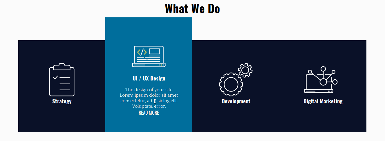
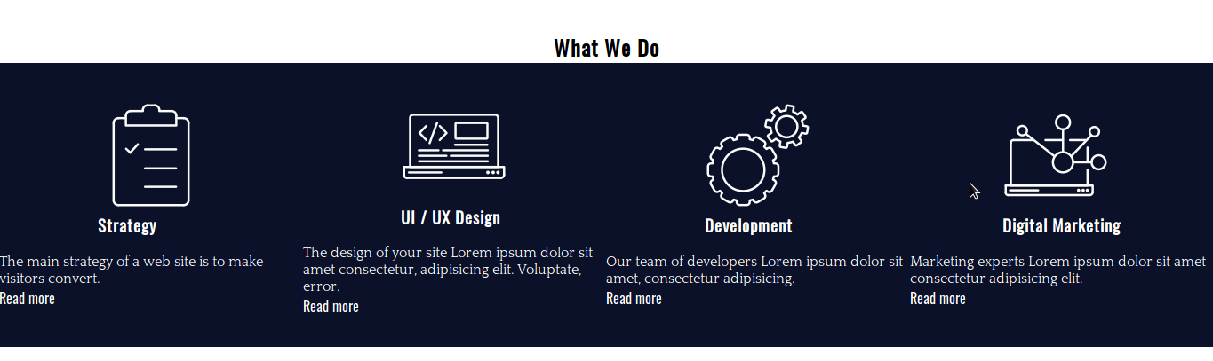
ウェブエージェンシーの通常のサービスを宣伝する4枚のカードがあります。 それらにカーソルを合わせると、カード内の各要素は、目的の効果を達成するために異なる遷移を持ちます。
ステップ#2。-HTML
- お好みのコードエディタを開きます
- index.htmlというHTMLファイルを作成します
- このコードをコピーして貼り付けます。
 <!DOCTYPE html>
 <html lang="en">
 <head>
 <meta charset="UTF-8">
 <meta name="viewport" content="width=device-width, initial-scale=1.0">
 <meta http-equiv="X-UA-Compatible" content="ie=edge">
 <title>CSS Transitions</title>
 <link href="https://fonts.googleapis.com/css?family=Oswald|Quattrocento&display=swap" rel="stylesheet">
 <link rel="stylesheet" href="/style.css">
 </head>
 <body>
 <div class="experts">
 <h2>What We Do</h2>
 <div class="service-card-container">
 <div class="service-card">
 <div class="front">
 <span class="icon-strategy"></span>
 <h3>Strategy</h3>
 </div>
 <div class="hidden">
 <p>The main strategy of a web site is to make visitors convert.</p>
 <a href="#">Read more</a>
 </div>
 </div>
 <div class="service-card">
 <div class="front">
 <span class="icon-ui-ux-design"></span>
 <h3>UI / UX Design</h3>
 </div>
 <div class="hidden">
 <p>The design of your site Lorem ipsum dolor sit amet consectetur, adipisicing elit. Voluptate, error.</p>
 <a href="#">Read more</a>
 </div>
 </div>
 <div class="service-card">
 <div class="front">
 <span class="icon-development"></span>
 <h3>Development</h3>
 </div>
 <div class="hidden">
 <p>Our team of developers Lorem ipsum dolor sit amet, consectetur adipisicing.</p>
 <a href="#">Read more</a>
 </div>
 </div>
 <div class="service-card">
 <div class="front">
 <span class="icon-digital-marketing"></span>
 <h3>Digital Marketing</h3>
 </div>
 <div class="hidden">
 <p>Marketing experts Lorem ipsum dolor sit amet consectetur adipisicing elit.</p>
 <a href="#">Read more</a>
 </div>
 </div>
 </div>
 </div>
 </body>
</html><!DOCTYPE html>
<html lang="en">
<head>
<meta charset="UTF-8">
<meta name="viewport" content="width=device-width, initial-scale=1.0">
<meta http-equiv="X-UA-Compatible" content="ie=edge">
<title>CSS Transitions</title>
<link href="https://fonts.googleapis.com/css?family=Oswald|Quattrocento&display=swap" rel="stylesheet">
<link rel="stylesheet" href="/style.css">
</head>
<body>
<div class="experts">
<h2>What We Do</h2>
<div class="service-card-container">
<div class="service-card">
<div class="front">
<span class="icon-strategy"></span>
<h3>Strategy</h3>
</div>
<div class="hidden">
<p>The main strategy of a web site is to make visitors convert.</p>
<a href="#">Read more</a>
</div>
</div>
<div class="service-card">
<div class="front">
<span class="icon-ui-ux-design"></span>
<h3>UI / UX Design</h3>
</div>
<div class="hidden">
<p>The design of your site Lorem ipsum dolor sit amet consectetur, adipisicing elit. Voluptate, error.</p>
<a href="#">Read more</a>
</div>
</div>
<div class="service-card">
<div class="front">
<span class="icon-development"></span>
<h3>Development</h3>
</div>
<div class="hidden">
<p>Our team of developers Lorem ipsum dolor sit amet, consectetur adipisicing.</p>
<a href="#">Read more</a>
</div>
</div>
<div class="service-card">
<div class="front">
<span class="icon-digital-marketing"></span>
<h3>Digital Marketing</h3>
</div>
<div class="hidden">
<p>Marketing experts Lorem ipsum dolor sit amet consectetur adipisicing elit.</p>
<a href="#">Read more</a>
</div>
</div>
</div>
</div>
</body>
</html>
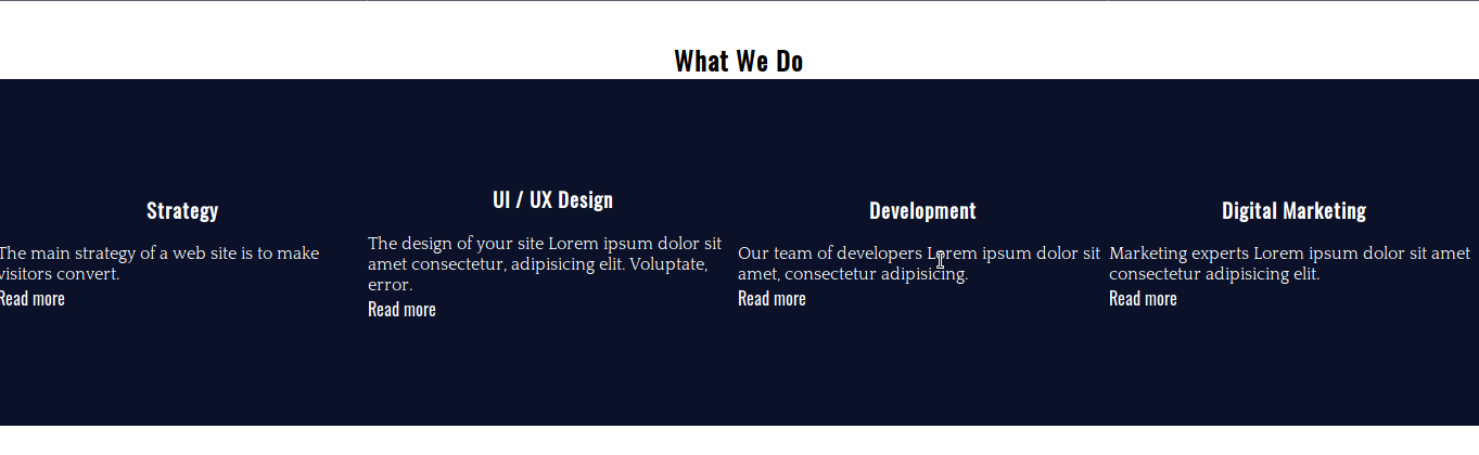
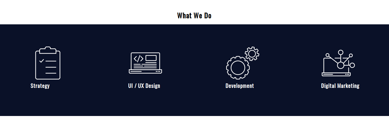
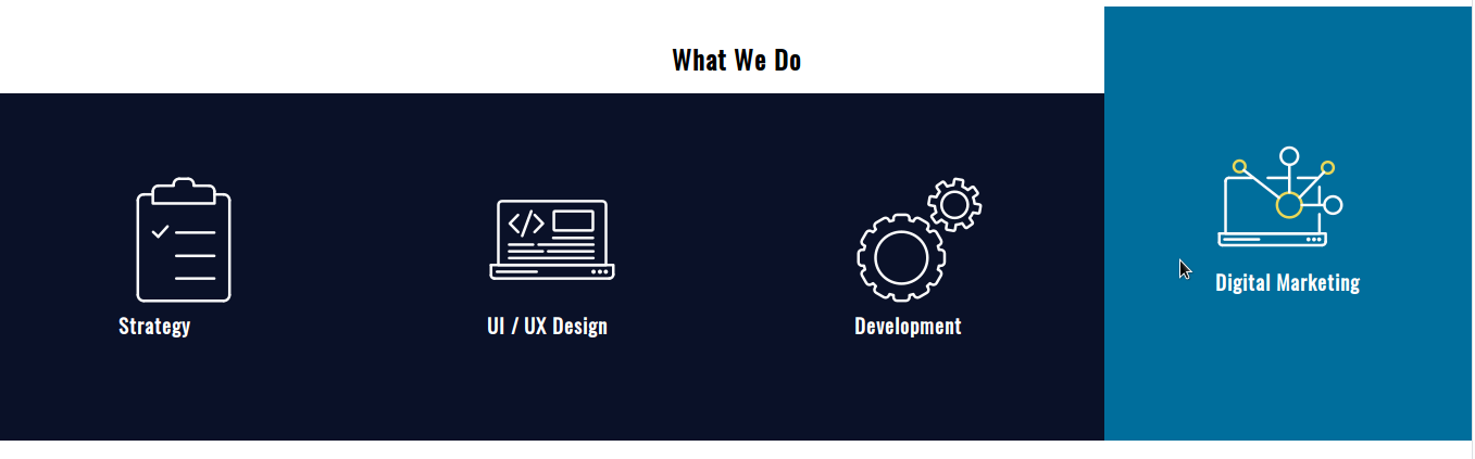
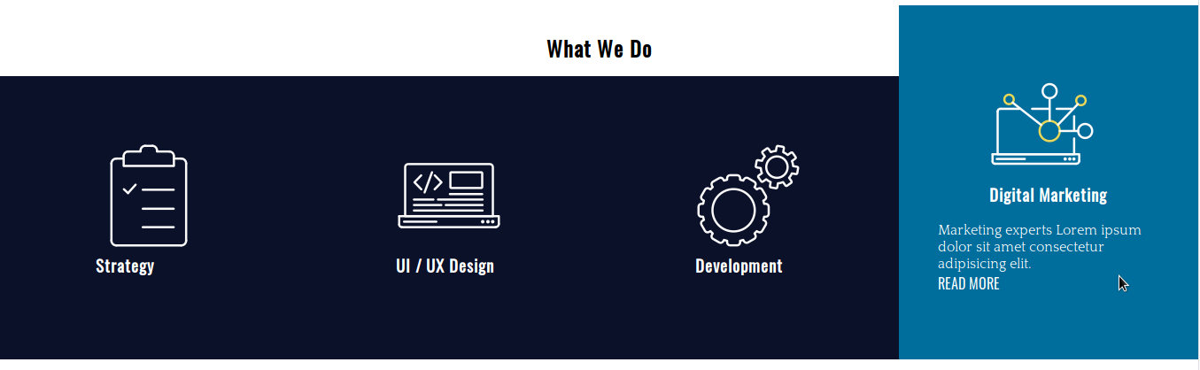
service-card-containerには4つの異なるカードがあります。 各カードは、アイコン、タイトル、テキスト、およびサイト上の対応する情報へのリンクで構成されています。 カードにカーソルを合わせるとテキストとリンクが表示されます。それ以外の場合は非表示になります。
ステップ3。 -基本的なCSSスタイル
- CSSファイルを作成してstyle.cssと呼びます— HTMLコードには、このファイルとGoogleFontsへのリンクが既に含まれています。
- これらのスタイルをコピーして貼り付け、タイポグラフィスタイルとカードの背景色を変更します。
 /* BASIC RESET */

 * {
 margin: 0;
 padding: 0;
 box-sizing: border-box;
 list-style: none;
 text-decoration: none;
 }

 /* TYPOGRAPHY */

 body {
 font-family: 'Quattrocento', serif;
 }

 h1,
 h2,
 h3,
 h4,
 h5,
 h6,
 a {
 font-family: 'Oswald', sans-serif;
 }

 /* BACKGROUND */

 .service-card {
 background-color: #0a1128;
 color: white;
 }

 .service-card a {
 color: white;
}/* BASIC RESET */
* {
margin: 0;
padding: 0;
box-sizing: border-box;
list-style: none;
text-decoration: none;
}
/* TYPOGRAPHY */
body {
font-family: 'Quattrocento', serif;
}
h1,
h2,
h3,
h4,
h5,
h6,
a {
font-family: 'Oswald', sans-serif;
}
/* BACKGROUND */
.service-card {
background-color: #0a1128;
color: white;
}
.service-card a {
color: white;
}
ステップ4。 -レイアウトスタイル
CSSグリッドを使用してカードを作成し、水平に配置してみましょう。
- CSSコードを編集します。
 /* LAYOUT */

 .experts {
 margin-top: 36px;
 }

 .experts h2 {
 text-align: center;
 }

 .service-card-container {
 display: grid;
 grid-template-columns: repeat(4, 1fr);
 }

 .service-card {
 display: grid;
 grid-template-columns: 1fr;
 grid-template-rows: auto auto;
 grid-row-gap: 18px;
 justify-items: center;
 align-content: center;
 height: 320px;
 }
サービスカードコンテナは、4列の水平グリッドです。 各カードは、2行のグリッドコンテナとしても宣言されています。 カードごとに固定の高さを宣言していることに注意してください。

ステップ5。 -イメージスプライト
W3Schoolsによると、画像スプライトは1つの画像にまとめられた画像のコレクションです。 ページがロードする必要のある画像ごとにサーバー要求を行う必要がないため、帯域幅を節約できます。 画像を1回要求してから、CSSコード内で画像の必要な部分をマッピングします。
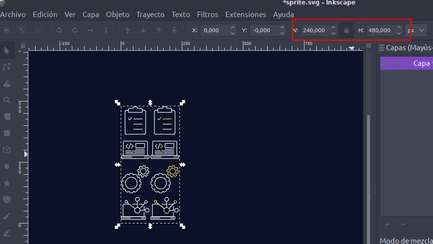
画像の幅は240ピクセル、高さは480ピクセルです。 各アイコンは120x120pxの領域をカバーしています。 それぞれの画像をマッピングするには、画像の左上隅から座標(0px 0px)で開始し、「左-上」の順序に従います。
このように、スプライトの左側の列の画像は次の場所にあります。
- 0px 0px
- 0px -120px
- 0px -240px
- 0px -360px
これらは、ホバリングする前に使用する画像です。
スプライトの右の列の画像は次の場所にあります。
- 120px 0px
- 120px -120px
- 120px -240px
- 120px -360px
- CSSコードを編集します。
 .service-card span {
 display: inline-block; /* to be able to apply width and height to the element */
 }

 .icon-strategy {
 background: url(./sprite.png) 0px 0;
 width: 120px;
 height: 120px;
 }

 .icon-ui-ux-design {
 background: url(./sprite.png) 0px -120px;
 width: 120px;
 height: 120px;
 }

 .icon-development {
 background: url(./sprite.png) 0px -240px;
 width: 120px;
 height: 120px;
 }
 .icon-digital-marketing {
   background: url(./sprite.png) 0px -360px;
   width: 120px;
   height: 120px;
}/* LAYOUT */
.experts {
margin-top: 36px;
}
.experts h2 {
text-align: center;
}
.service-card-container {
display: grid;
grid-template-columns: repeat(4, 1fr);
}
.service-card {
display: grid;
grid-template-columns: 1fr;
grid-template-rows: auto auto;
grid-row-gap: 18px;
justify-items: center;
align-content: center;
height: 320px;
}
サービスカードコンテナは、4列の水平グリッドです。 各カードは、2行のグリッドコンテナとしても宣言されています。 カードごとに固定の高さを宣言していることに注意してください。
ステップ5。 -イメージスプライト
W3Schoolsによると、画像スプライトは1つの画像にまとめられた画像のコレクションです。 ページがロードする必要のある画像ごとにサーバー要求を行う必要がないため、帯域幅を節約できます。 画像を1回要求してから、CSSコード内で画像の必要な部分をマッピングします。
画像の幅は240ピクセル、高さは480ピクセルです。 各アイコンは120x120pxの領域をカバーしています。 それぞれの画像をマッピングするには、画像の左上隅から座標(0px 0px)で開始し、「左-上」の順序に従います。
このように、スプライトの左側の列の画像は次の場所にあります。
- 0px 0px
- 0px -120px
- 0px -240px
- 0px -360px
これらは、ホバリングする前に使用する画像です。
スプライトの右の列の画像は次の場所にあります。
- 120px 0px
- 120px -120px
- 120px -240px
- 120px -360px
- CSSコードを編集します。
 .service-card span {
 display: inline-block; /* to be able to apply width and height to the element */
 }

 .icon-strategy {
 background: url(./sprite.png) 0px 0;
 width: 120px;
 height: 120px;
 }

 .icon-ui-ux-design {
 background: url(./sprite.png) 0px -120px;
 width: 120px;
 height: 120px;
 }

 .icon-development {
 background: url(./sprite.png) 0px -240px;
 width: 120px;
 height: 120px;
 }
 .icon-digital-marketing {
   background: url(./sprite.png) 0px -360px;
   width: 120px;
   height: 120px;
} 
悪くないですよね? いくつかのパディングでこの部分を仕上げるために、いくつかの化粧品のタッチを追加しましょう。
- CSSコードを編集します。
 .service-card-container {
 display: grid;
 grid-template-columns: repeat(4, 1fr);
 padding: 0.9em 0 1.8em 0;
 }

 .service-card {
 display: grid;
 grid-template-columns: 1fr;
 grid-template-rows: auto auto;
 grid-row-gap: 18px;
 justify-items: center;
 align-content: center;
 height: 320px;
 padding: 0 2.75em;
}.service-card-container {
display: grid;
grid-template-columns: repeat(4, 1fr);
padding: 0.9em 0 1.8em 0;
}
.service-card {
display: grid;
grid-template-columns: 1fr;
grid-template-rows: auto auto;
grid-row-gap: 18px;
justify-items: center;
align-content: center;
height: 320px;
padding: 0 2.75em;
}
ステップ#6。 -CSSトランジション
CSS遷移プロパティには、4つの異なる子プロパティがあります。
- 遷移プロパティ(遷移が適用される要素のプロパティ)
- 移行期間
- 遷移タイミング機能
- 遷移遅延
省略形は次のとおりです。
遷移:[遷移プロパティ] [遷移期間] [遷移タイミング関数] [遷移遅延]
- CSSコードを編集します。
 /* TRANSITIONS */

 .service-card {
 transition: margin-top 0.2s ease-out, height 0.2s ease-out, background 0.2s ease-out;
 }

 .service-card:hover {
 margin-top: -5em;
 height: 25em;
 background: #006e9c;
 }
お気づきのように、コンマで区切ることにより、異なる要素プロパティに複数の遷移を適用することができます。 これらの遷移には遅延がありません。
カードを上に転がすには、上部に負のマージンを設定し、このマージンの絶対値を要素の高さに追加します(320px == 20em)。
今度は、画像をターゲットにして、トランジションで画像を変更します。
- CSSコードを編集します。
 .icon-strategy,
 .icon-ui-ux-design,
 .icon-development,
 .icon-digital-marketing {
   transition: background 0.4s step-end;
 }

 .service-card:hover .icon-strategy {
   background: url(./sprite.png) 120px 0;
   width: 120px;
   height: 120px;
 }

 .service-card:hover .icon-ui-ux-design {
   background: url(./sprite.png) 120px -120px;
   width: 120px;
   height: 120px;
 }

 .service-card:hover .icon-development {
   background: url(./sprite.png) 120px -240px;
   width: 120px;
   height: 120px;
 }

 .service-card:hover .icon-digital-marketing {
   background: url(./sprite.png) 120px -360px;
   width: 120px;
   height: 120px;
 }
もう一度:
- 遷移プロパティ:背景
- 遷移時間:0.4秒
- 遷移タイミング機能:ステップエンド
残りは、画像スプライトの正確な座標(上記で詳述)にマッピングするだけです。
最後に、 .hiddenコンテナをターゲットにしましょう。
- CSSコードを編集します。
 .hidden,
 .hidden a {
 transition: color 0.4s ease-out 0.2s;
 }

 .service-card:hover .hidden {
 height: auto;
 }
 .service-card:hover .hidden,
 .service-card:hover .hidden a {
 color: white;
 }
ここで注意すべき2つの詳細があります。
- テキストの色の遷移には、0.2秒の遷移遅延があります
- 要素の高さプロパティは、トランジションなしでホバーすると変化します
トランジションはすべての主要なブラウザでサポートされています。
この演習が気に入っていただけたでしょうか。 読んでくれてありがとう!
コードはここにあります。