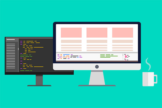
มีบางอย่างที่ฉันต้องการให้คุณทราบอย่างยิ่ง: รูปภาพเหมาะสำหรับอีเมลตราบเท่าที่มีขนาด a: ขนาดเล็ก และ b: มีแท็ก alt ที่อธิบายได้ดี ฉันแน่ใจว่าคุณทราบดีว่าเพื่อให้รูปภาพปรากฏในอีเมล ผู้รับอีเมลนี้ต้องอนุญาตให้รูปภาพปรากฏ หากไม่ทำเช่นนั้นก็ไม่มีอะไรจะบอกได้ว่าควรคาดหวังอะไร นอกจากนี้ยังเป็นปัญหาในการเข้าถึงหากคุณไม่ได้ให้คำอธิบายสำหรับผู้ใช้ที่ตาบอด อย่างไรก็ตามนั่นเป็นอีกเรื่องหนึ่ง บทเรียนคือ: ใช้รูปภาพขนาดเล็กที่มีแท็ก alt เสมอ!
<table width="700" border="0" cellpadding="0" cellspacing="0" > <tr><!-- First row - header --> <td colspan="2"><a href="http://www.www.webdesignviews.com" target="_blank"><img src="images/logo.png" width="346" alt="DevGarage"/></a></td> </tr> <tr><!-- Second row --> <td colspan="2"> <h1><a href="http://www.www.webdesignviews.com" >We launched our mobile site!</a></h1> <img src="images/screenshot.png" width="400" alt="Mobile blog screenshots."/> </td> </tr> <tr><!-- Third row --> <td><img src="images/screenOutlines.png" width="300" alt="PSD freebie"/></td> <td> <h2><a href="#">A PSD just for you!</a></h2> <p>We have decided to kick off our mobile launch by giving away an awesome PSD of device templates for you to showcase your next project - whether or not it is responsive. </p> </td> </tr> <tr> <td><!-- Fourth row --> <h3><a href="#">The smell of whitespace</a></h3> <p>A short post that is very straightforward in which I will explain what are the benefits of whitespace in web design.</p> <p>Read more</p> </td> <td> <h3><a href="#">Web typography trends</a></h3> <p>From a user's perspective web-safe fonts were great but from a designers perspective it was a creative disaster.</p> <p>Read more</p> </td> </tr> <tr><!-- Fifth row - footer --> <td colspan="2"> Copyright information and <a href="#">unsubscribe</a> link.</td> </tr> </table>
สไตล์อินไลน์
สิ่งสุดท้ายที่เราจะทำคือใส่สไตล์ CSS แบบอินไลน์สำหรับเทมเพลตอีเมล HTML นี้ เป็นสิ่งที่ทำให้รูปลักษณ์ของอีเมลที่คุณเห็นจนถึงตอนนี้อีเมลนี้ไม่ได้ดูสวยงามเลย ฉันจะแบ่งส่วนนี้ออกเป็นชิ้นเล็กๆ เพื่อไม่ให้มันมากเกินไป
<tr><!-- Second row --> <td colspan="2"> <h1> We launched our mobile site!</a></h1> <img src="images/screenshot.png" width="400" alt="Mobile blog screenshots."/> </td> </tr>
<tr><!-- Third row --> <td><img src="images/screenOutlines.png" width="300" alt="PSD freebie"/></td> <td> <h2><a href="#">A PSD just for you!</a></h2> <p>We have decided to kick off our mobile launch by giving away an awesome PSD of device templates for you to showcase your next project - whether or not it is responsive. </p> </td> </tr>
<tr bgcolor="#464646"> <!-- Fourth row --> <td> <h3><a href="#">The smell of whitespace</a></h3> <p>A short post that is very straightforward in which I will explain what are the benefits of whitespace in web design.</p> <pwidth:320px; padding: 30px;"> <h3><a href="#">Web typography trends</a></h3> <p>From a user's perspective web-safe fonts were great but from a designer's perspective it was a creative disaster.</p> <plwptoc12">Fifth Row – Footer<tr bgcolor="#464646"> <!-- Fourth row --> <td> <h3><a href="#">The smell of whitespace</a></h3> <p>A short post that is very straightforward in which I will explain what are the benefits of whitespace in web design.</p> <pwidth:320px; padding: 30px;"> <h3><a href="#">Web typography trends</a></h3> <p>From a user's perspective web-safe fonts were great but from a designer's perspective it was a creative disaster.</p> <plwptoc12">Fifth Row – Footer